Posey's Tips & Tricks
What's New in Microsoft's Yammer Makeover
Since Microsoft acquired it in 2012, Yammer has been the odd application out. Microsoft's latest updates bring the chat application closer to the rest of the Microsoft 365 family.
Although it's been a while, I have occasionally said that Yammer seems to be the one Microsoft 365 application that doesn't fit in with the others. From the beginning, Yammer had its own look and feel that was largely inconsistent from the other Microsoft 365 applications. In some ways, this was to be expected since Microsoft purchased Yammer rather than build it from scratch.
Over time, though, Yammer has evolved to feel more like a native Microsoft 365 application. Additionally, Microsoft is in the process of giving Yammer a major makeover that I think will be well-received by most organizations.
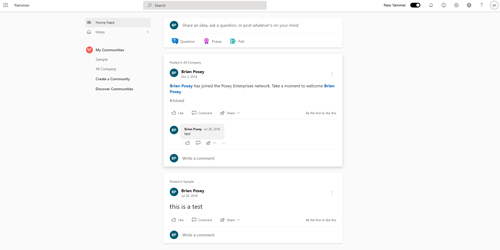
If you look at Figure 1, you can see what Yammer looks like today. As I'm sure you will notice in the screen capture, Yammer isn't something that I actually use myself, as evidenced by the test messages from four and six years ago. Even if those test messages are old, however, the interface within which the test messages are being displayed is current.
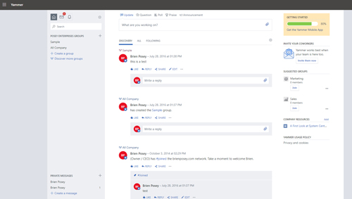 [Click on image for larger view.] Figure 1: This is what Yammer looks like today.
If you want to see what Microsoft has in store for Yammer, you need only enable the public preview. To do so, log into Microsoft 365 as an administrator and then open the Yammer Admin Center. If you look at Figure 2, you will notice that the last item in the console tree's Network section is New Yammer.
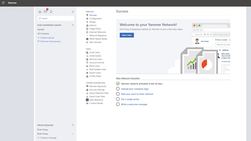 [Click on image for larger view.] Figure 2: Click on the New Yammer option.
Go ahead and click on the New Yammer option. When you do, you will be taken to the screen shown in Figure 3.
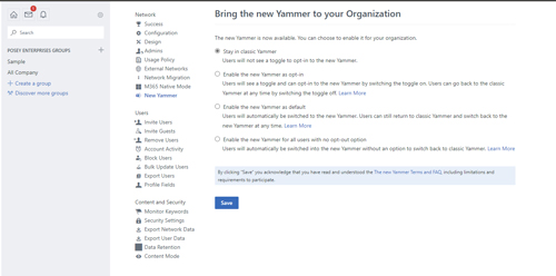 [Click on image for larger view.] Figure 3: Microsoft provides several different options for enabling the new Yammer interface.
As you can see in the figure above, Microsoft provides you with four different options for the new Yammer experience. The first option is to stick to using the classic Yammer experience. This is the default option, and doesn't really do anything.
The second option is to enable the new Yammer experience as an opt-in. Selecting this option causes a toggle bar to be displayed within the user's Yammer interface, thereby giving each user the option to toggle between the new Yammer interface and the classic interface.
The third option is to enable the new Yammer interface as the default option. When you select this option, users will automatically be provided with the new Yammer experience, but will also be given a toggle bar that they can use to switch back to the classic interface if they prefer.
Finally, the fourth option enables the new Yammer experience for everyone, but without the toggle bar. This means that users won't be able to revert to the classic interface.
When users open Yammer with the new interface enabled for the first time, they will see a screen similar to the one shown in Figure 4, guiding them through the new features. The introductory wizard makes a point of telling users that:
- The communities they mark as their favorites will now appear at the top of their Communities list.
- Conversations from the people that users follow, trending topics and new content will now be delivered through a single, customized feed.
- Items such as the search interface, notifications and access to the Yammer settings are now displayed at the top of the screen, where they are easier to find.
- A new conversation filter allows users to easily find new conversations, locate unanswered questions and more.
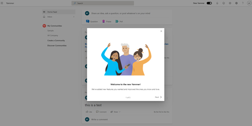 [Click on image for larger view.] Figure 4: An introductory wizard guides users through the new features.
You can see what the new Yammer interface looks like in Figure 5. As you can see in the figure, it isn't all that different from the classic interface shown back in Figure 1. One of the things you will notice as you look at the figure is the toggle bar (labeled New Yammer) at the top of the screen. This is the toggle bar that lets users switch between the classic and the new Yammer experience.
 [Click on image for larger view.] Figure 5: This is what the new Yammer interface looks like.
Besides the items I mentioned earlier, the changes to the Yammer interface are subtle. User names, for instance, are bolded or shown in blue. Some of the fonts also seem to be a bit larger. Microsoft has also added Announcements and an Update options to the Question, Praise and Poll options that previously existed for posts.
Few would likely consider the new Yammer interface to be a huge leap forward. At the same time, though, the new interface is a lot cleaner than its predecessor and will likely be well-received by most users.
About the Author
Brien Posey is a 22-time Microsoft MVP with decades of IT experience. As a freelance writer, Posey has written thousands of articles and contributed to several dozen books on a wide variety of IT topics. Prior to going freelance, Posey was a CIO for a national chain of hospitals and health care facilities. He has also served as a network administrator for some of the country's largest insurance companies and for the Department of Defense at Fort Knox. In addition to his continued work in IT, Posey has spent the last several years actively training as a commercial scientist-astronaut candidate in preparation to fly on a mission to study polar mesospheric clouds from space. You can follow his spaceflight training on his Web site.