News
Azure Active Directory Login Design Change Coming in June
Microsoft gave advance notice this month that it's planning to change the user interface for carrying out Azure Active Directory logins, yet again.
In essence, the sign-in interface is getting simplified with a more "centered" look. It'll be losing the "Back" button that's part of the current experience. In addition, the badge icon that tells users it's a work account, rather than personal account, will be going away. The new experience will show up "on all authentication flows," including screens to change passwords and screens with multifactor authentication requests.
The design changes will appear gradually in phases. In early May, users will see a "notification banner," namely a pop-up box, telling them that the sign-in experience will be changing. In mid-May, the notification banner will have a link to preview the new design (see image). After clicking it, end users will be able to switch back to the old experience, if wanted.
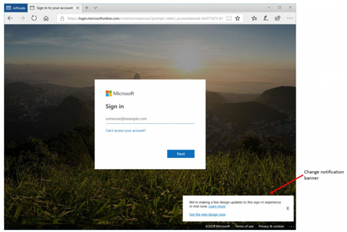 [Click on image for larger view.] New design for Azure Active Directory logins. (Source: April 4 Microsoft blog)
However, in mid-June, Microsoft plans to finalize this design. It'll be at the "general availability" product stage for all Azure AD tenancies.
The announcement promised that the design change wouldn't be disruptive for organizations:
This is solely a visual UI change with no changes to functionality. Existing company branding settings will carry forward to the updated UI.
That last sentence likely is a welcome assurance. Last year, Microsoft pulled back on an Azure AD login design change that was intended to fix the business-to-business "logic" of the sign-in experience. Instead, some organizations apparently complained that the changes had wrecked their branding and customizations. They had been taken by surprise by its arrival, as well. In response, Microsoft promised to give a 30-day advance notice regarding any "disruptive" changes to the Azure AD sign-in dialog box.
On top of the new design changes coming for Azure AD tenancies, organizations that use Active Directory Federation Services (ADFS), a Windows Server 2016 role, are getting some help to enable the new sign-in experience. To that end, Microsoft published a new style sheet at the GitHub repository.
Organizations can use this ADFS style sheet to get the same "centered login page" experience that Microsoft is creating for its Azure AD tenancies. They can use it to customize the login screen and have "a consistent look across federated sign-ins," according to Microsoft.
Based on comments associated with Microsoft's announcement, some organizations aren't too happy with Microsoft's plan to scrap the work account icon. End users get confused between their work and personal Microsoft accounts, and then they call IT for support, it was said.
Another comment was positive about the coming changes, suggesting that the new interface looks like Google's design.
About the Author
Kurt Mackie is senior news producer for 1105 Media's Converge360 group.