Posey's Tips & Tricks
Taking Another Look at Office 365 Planner
Initially underwhelmed by Microsoft's project management app, Brien sees what it can do in a real-world scenario.
Before the holiday break, I wrote a column about an Office 365 app called Planner. Planner is a lightweight project management app that looks and feels a lot like Trello. At the time that I wrote that column, I wasn't super impressed by the app. As time went on, though, I just couldn't shake the feeling that it might be useful after all.
To make a long story short, I decided to try using Planner as a tool for organizing my writing assignments. Overall, it seems to work pretty well for that, but like any other tool, it does have its advantages and disadvantages.
Before I really get into talking about how using Planner worked out for me in the real world, let me just quickly recap the tool's basic functionality. Planner is based around the use of cards and buckets. Cards are kind of like digital index cards, containing information related to a specific task. Buckets act as a way of grouping those cards. In my case, for example, my original idea was to use one card for each assignment, and then create a To-Do bucket and a Complete bucket. Ultimately, however, I found it to be more effective to organize the cards in a different way.
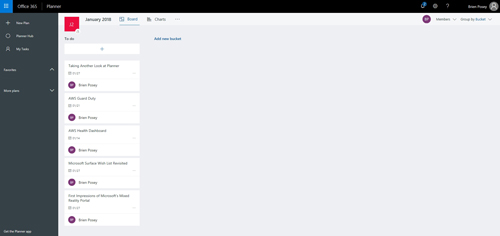
If you look at Figure 1, you can see the Planner interface. I have created a group of cards, each corresponding to one of the columns that I plan to write this month. I have not yet created cards for this month's assignments, because I wanted to leave the interface relatively uncluttered in the screen captures.
 [Click on image for larger view.] Figure 1: This is what the cards look like.
There are a few things that I want to point out in the above screen capture. First, if you look in the upper-left portion of the screen, you will notice that it says January 2018. This caption isn't being pulled from a calendar -- it's actually the name of a bucket. I created a January 2018 bucket to store my January 2018 assignments.
You can also see that each card lists the name of the task (an assignment name, in this case), the due date and who the task is assigned to (me). That's great and all, but there was one big problem with organizing things in this way: If you go back and look at the cards, you will notice that they are not organized in any sort of cohesive order. The due dates are widely varied. That isn't really an issue if there are only five cards, as is shown above, but you can imagine how the random order of the cards could become an issue of there were dozens of cards. Thankfully, there is a way to sort the cards.
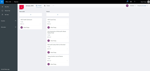
The upper-right portion of the interface contains a drop-down that says Group By Bucket. Clicking on this bucket gives you the ability to sort the tasks by due date, progress or by a few other labels. For example, if you look at Figure 2 below, you can see that Planner shows me which tasks are due next week.
 [Click on image for larger view.] Figure 2: The cards have been grouped by due date.
One more thing that you might have noticed as you looked at the previous screen captures is that the cards themselves are a bit simplistic. Oftentimes, there are detailed notes that go along with assignments. Fortunately, Planner can accommodate those notes.
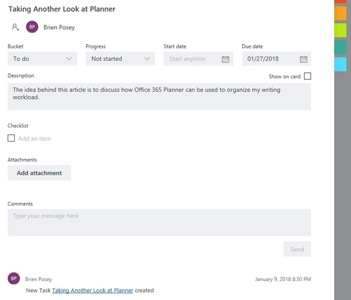
Clicking on a card reveals a more detailed view of the card, with fields that allow you to add a description, comments and even an attachment. You can see what this looks like in Figure 3. You will also notice in the figure that the cards contain a series of colored boxes on the right. These colored boxes allow you to add labels to the card. In my case, I might, for example, use the label to mark who I am supposed to send the assignment to.
 [Click on image for larger view.] Figure 3: Here is a more detailed look at a card.
I mentioned at the beginning of this article that Planner has its good points and its bad points. I think that Planner is going to be really useful for keeping me organized and helping me to track my progress. Even so, I wish that I could simply access it through a desktop application rather than having to take the time to log into a Web interface every time I need to use it (a mobile app is available).
I also wish that Planner would allow me to add custom fields to cards, or to create card templates that would allow me to create various card types (such as a writing assignment card, a webcast card, et cetera).
About the Author
Brien Posey is a 22-time Microsoft MVP with decades of IT experience. As a freelance writer, Posey has written thousands of articles and contributed to several dozen books on a wide variety of IT topics. Prior to going freelance, Posey was a CIO for a national chain of hospitals and health care facilities. He has also served as a network administrator for some of the country's largest insurance companies and for the Department of Defense at Fort Knox. In addition to his continued work in IT, Posey has spent the last several years actively training as a commercial scientist-astronaut candidate in preparation to fly on a mission to study polar mesospheric clouds from space. You can follow his spaceflight training on his Web site.