Posey's Tips & Tricks
Fixing Outlook Font Inconsistencies
It's the little things that can drive us nuts. Here's how to save some of your sanity.
I recently ran into an odd and somewhat annoying problem with regard to the way that the desktop version of Outlook uses fonts. I'm not talking about the fonts used when composing a message, or even the fonts that are displayed when reading a message. Instead, I am referring to the fonts that are displayed within the Outlook interface.
A couple of months ago, I worked through a major computer upgrade in which I refreshed nearly all of the hardware that I use in my production environment. As a part of that refresh effort, I replaced the monitors on my primary desktop PC (the machine where I use Outlook). My previous monitors were at least 15 years old and only supported HD resolution. They were also suffering from some image burn and the colors were badly fading as well. I honestly don't know why it took me so long to replace those monitors, but as a part of my hardware refresh, I replaced my badly aging monitors with large format, 4K displays.
One of the side effects to this upgrade was that the Outlook interface looked smaller as a result of the higher resolution. I, of course, resized the Outlook window, but the text displayed within Outlook's user interface was smaller than I really would have preferred.
Fortunately, like other Office applications, Outlook is highly customizable and Microsoft makes it easy to adjust the font size. To do so, just select the View tab at the top of the Outlook interface and then click on Current View, followed by View Settings. At this point, Outlook displays the Advanced View Settings window, which you can see in Figure 1. As you can see in the figure, you can adjust the fonts by clicking on the Other Settings button. This causes Outlook to display the screen shown in Figure 2.
 [Click on image for larger view.] Figure 1. This is Outlook's Advanced View Settings window.
 [Click on image for larger view.] Figure 2. The Other Settings window allows you to adjust the fonts that are used by Outlook.
As you can see in the figure above, the Other Settings screen is relatively straightforward, particularly with regard to Outlook's use of fonts. Outlook allows you to define a column font, a row font, and a message preview font. To do so, you need only to click the corresponding button and then choose your font, style, size, and script. You can see an example of the font selection window in Figure 3.
 [Click on image for larger view.] Figure 3. This is the screen that you use to choose the fonts used by Outlook.
Although the font selection process is really simple, all did not go according to plan. I configured Outlook to use a 12-point Arial font for everything. At first, that seemed to be ideal, but then the weirdness started.
What I noticed was that Outlook was not applying my font configuration to new messages that arrived. Those messages would be displayed in a smaller point size and with a different type face. As soon as I opened those messages however, Outlook would treat the messages as having been read, and would at that point display them using the correct font.
In order to display newly arrived messages in a way that was consistent with the way that messages that have already been read are displayed, I had to use an Outlook feature called Conditional Formatting. If you look back at Figure 1, you will notice that the Advanced View Settings screen includes a Conditional Formatting button. Clicking this button takes you to a screen that allows you to set rules for various types of messages. If you look at Figure 4, for example, you can see that there is a rule for unread messages.
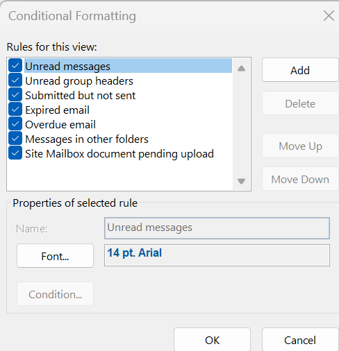 [Click on image for larger view.] Figure 4. Conditional Formatting lets you set rules for various message types.
To set a conditional formatting rule, just select the message type and then click the Font button. Unfortunately, you can't choose the exact point size that you want to use. Instead, the Font dialog box gives you choices such as normal, smaller, big and bigger. As you can see in Figure 5, I selected Bigger, which corresponds to a 14-point font. Oddly enough however, the 14 point font that I used in my conditional formatting rule matches the 12-point font that I selected on the Other Settings screen.
 [Click on image for larger view.] Figure 5. This is the font selection screen used by the conditional formatting rules.
Ultimately, I had to use a bit of trial and error in order to get Outlook to display messages the way that I wanted it to. Eventually however, I made it work and am completely satisfied with the results.
About the Author
Brien Posey is a 22-time Microsoft MVP with decades of IT experience. As a freelance writer, Posey has written thousands of articles and contributed to several dozen books on a wide variety of IT topics. Prior to going freelance, Posey was a CIO for a national chain of hospitals and health care facilities. He has also served as a network administrator for some of the country's largest insurance companies and for the Department of Defense at Fort Knox. In addition to his continued work in IT, Posey has spent the last several years actively training as a commercial scientist-astronaut candidate in preparation to fly on a mission to study polar mesospheric clouds from space. You can follow his spaceflight training on his Web site.