Caution Rules as Microsoft Unveils Changes to Office Ribbon, Colors and Search
Microsoft on Wednesday unveiled big feature changes -- on a slow timetable -- for the Office user experience, including a simplified ribbon, new colors and icons, and a search overhaul.
The changes will roll out in stages over the next few months, starting with Web versions, and will be exclusive to Office.com and Office 365. Apparently remembering the significant user backlash that accompanied the original rollout of the Office ribbon, Microsoft is taking care to present the changes as a work-in-progress that will be tested with initial user groups and modified as necessary, rather than blasted out to the billion-plus monthly users of Office.
"We plan on carefully monitoring usage and feedback as the changes roll out, and we'll update our designs as we learn more," wrote Jared Spataro, corporate vice president for Office and Windows Marketing, in a blog post announcing the updates.
Additionally, user control over implementing the changes is a key design principle. "We want to give users control, allowing them to toggle significant changes on and off," Spataro said. In fact, there is no current schedule to push the ribbon changes to Word, Excel and PowerPoint for Windows. "They're the preferred experience for users who want to get the most from our apps. Users have a lot of 'muscle memory' built around these versions, so we plan on being especially careful with changes that could disrupt their work," he wrote.
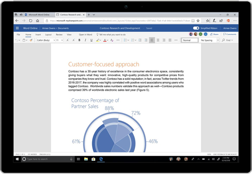
The ribbon takes up less screen real estate and is more context-driven, with Microsoft trying to anticipate what a user wants to do. An underline appears below the main menu tabs, with options appearing underneath the tab in a single line that uses new colors and icons intended to provide more contrast and more intuitive navigation.
 [Click on image for larger view.] (Source: Microsoft)
In a video demonstration, Jon Friedman, chief designer for Office at Microsoft, opened a Word document from the Office 365 interface to demonstrate a new speediness to the process. "Office is rebuilt on a modern platform to be faster than ever," Friedman said.
The new search functionality includes a more prominent search bar and brings in what Microsoft calls "zero query search," in which recommendations are presented based on Microsoft's predictive algorithms and data about the user's behavior and working relationships.
Microsoft shared several milestones in its timeline for rolling out the new Office features:
- All commercial users of Office.com, SharePoint Online and the Outlook mobile app have immediate access to the search changes.
- Select consumer users of Web versions of Word will see the simplified ribbon this week.
- The color and icon changes will come to the Web versions of Word shortly.
- Select Insiders using Windows versions of Word, Excel and PowerPoint will see color and icon changes later this month.
- Color and icon changes will come to Outlook for Windows in July.
- Select Insiders will see the simplified ribbon on Outlook for Windows in July.
- In August, commercial users of Outlook on the Web will see the search changes.
- Also in August, Outlook for Mac users will get the color and icon changes.
Posted by Scott Bekker on 06/13/2018 at 10:41 AM