In-Depth
Top 8 Windows 8.1 Features and Fixes
The Windows 8.1 Preview reveals a much improved OS that fixes many of the flaws in the original Windows 8 release. Here's what to look for in the new OS.
Windows 8 is a study in contrasts. Both brilliant and frustrating, the new OS has challenged users and IT pros alike with its innovative UI, bold new approaches, and at times unfinished or botched implementations. These factors have resulted in an underwhelming launch for the game-changing OS.
A rapidly developed upgrade, Windows 8.1, aims to fix that. Available later this year free to all Windows 8 users, the new OS strikes savvy compromises, even as it continues to push boundaries in its bid to win over users of emerging touch-based tablets and devices. After attending the Microsoft Build conference in late June, I worked with the Windows 8.1 Preview on a trifecta of machines -- a six-month-old Dell XPS 12 convertible laptop, an 8-inch Acer Iconia W3 tablet and a 10-inch Microsoft Surface tablet -- to get a sense of what Microsoft has delivered with this update.
I found that it's delivered quite a lot. Windows 8.1 is a clear improvement over Windows 8 in virtually all aspects. It's more robust and more customizable than its predecessor, and it hands IT pros some welcome tools to introduce Windows 8.1 into enterprises of all sizes. Notably, it's decisively more reliable than the shipping OS it replaced on my Dell XPS 12 laptop. Still, Windows 8.1 remains what it is -- a revolution in Windows computing that may not sit well with those aligned with versions pre-dating Windows 8.
Start Again
Microsoft did a good thing when it reconsidered its hard stance on the Start button, which it had banished from the Windows 8 UI. While Microsoft hasn't brought back the familiar Start menu (with its compact stack of applications, file folders and resources), it has given users and IT managers the ability to desktop-ify the Windows 8.1 experience.
For instance, you can configure Windows 8.1 to boot straight to the old desktop, rather than the Windows 8 Start screen with its horizontal scroll of live tiles. Also, the Start button can be set to send you to the Apps screen, which shows all your installed desktop and Windows 8 apps, rather than to the Modern UI-based Start screen. What's more, the Apps screen can be set to show all your desktop-style apps first, followed by Modern apps broken into categories. If you or your people are doing work from the traditional desktop, Windows 8.1 makes it easier to stay there. To get to these capabilities, go to the desktop, right-click the Taskbar, click Properties and click the Navigation tab to access these options.
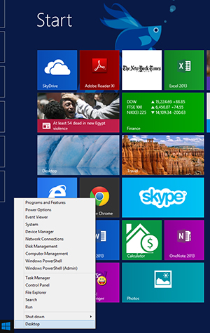 [Click on image for larger view.] Figure 1. The new Windows 8.1 Start screen's more flexible tiles, which are easier to organize.
Take Control
I get what Microsoft was trying to do with the Start interface and its flat screen of live tiles. I really do. But as you wrangle more and more Windows Store apps, and pin Web pages and file shortcuts and desktop app icons to that screen, you end up with a vast and incomprehensible plain of live tiles. Shuffling those tiles can do only so much.
Windows 8.1 introduces some helpful organization features to the Start screen. For instance, live tiles can now be arranged in groups, which you can name so that the character of each group is visible at a glance. In Start, swipe up from bottom screen edge and touch the Customize icon. This lets you assign group names and move and resize live tiles. Also, some tiles, like the default Weather app, now support the Large tile size (essentially a double-height-wide tile), and all support the new Small size that crams four icons into the space of one standard-sized tile. The Start screen is a lot more flexible now than it was when Windows 8 arrived.
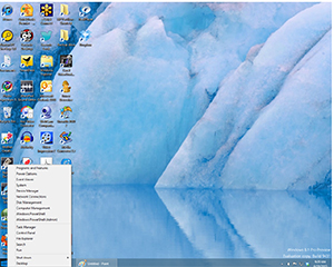 [Click on image for larger view.] Figure 2. The traditional Start button is back but it's not the same as the one it replaced.
On Display
When Microsoft introduced the Modern UI, multitasking for Windows Store apps was limited to two apps, running side-by-side in a main app/docked app screen arrangement. Docked apps display a compact UI, almost a smartphone presentation, that's useful for things such as viewing your music playlist or e-mail inbox. But the approach frustrated those wanting to view Web browser windows side-by-side or copy text from one visible document to another.
Windows 8.1 introduces a flexible multitasking scheme for Windows Store apps, supporting up to four windows per display (depending on resolution). While app windows must still fill the screen from top to bottom, horizontal size can be freely scaled. Squeeze a Windows Store app enough, and it'll snap into docked view, offering a space-conscious presentation. You can also now long-press links in e-mails and Web pages, commanding them to open into a new window and sliding the active window over. One caveat: Running three or four apps in the foreground could do a number on battery life, depending on how those apps behave.
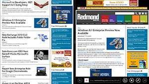 [Click on image for larger view.] Figure 3. Side-by-side browsing is a snap with the improved multi-tasking model in Windows 8.1.
Workplace Savvy
Windows 8.1 introduces a host of new, corporate-minded features -- including some that will require Windows Server 2012 R2 -- that should appeal to the Bring Your Own Device (BYOD) set. You can think of Workplace Join as a halfway house for personal PCs and devices that need to access company resources. IT managers can now grant and manage device access, without requiring that the systems be full members of the domain. There's also Work Folders, which enables the syncing of files from a Windows 8.1 device to a corporate file server, and Selective Wipe, which lets IT managers remove corporate data from remote systems while leaving personal data in place. From device-level encryption to improved biometrics, IT pros will find that the new OS expands the suitability of Windows 8.1-based PCs and devices in Windows-aligned businesses.
Search
If Google Inc. taught us one thing, it's that search is king. Microsoft has taken this lesson to heart with Windows 8.1, extending and refining the already-admirable search capabilities in the new OS. Swipe from the right edge of the screen and touch the Search icon, and you're presented with a context-aware Search panel that includes a refined dropdown list. You can search globally, or limit searches to files, system settings, or images and videos from the Web. Do a global search, and Bing combines results found on your system with those on the Web, and even does some slick presentation to surface resources and actions when you search for things such as celebrities, locations and media. A search for Burlington, Vt., for instance, dishes up a panel with current weather and links to Bing Maps and Travel, followed by a list of area attractions and thumbnail previews of Web sites matching the search. It's pretty cool.
Windows Store
I'll make no bones about this: the Microsoft Windows Store did not impress me in the past. Setting aside questions about the size and quality of the Windows Store app ecosystem, Windows Store itself didn't do a good job of prioritizing apps and helping users decide which ones might be worth their attention. That changes with Windows 8.1, thanks in part to a top-level redesign that prioritizes featured, popular and newly published apps. Gone is the endless scroll of tiny icons, replaced with large iconography, visible review ratings and helpful (if brief) descriptive text. Categories, selected by swiping from top or bottom, feature similarly improved presentation and management. On the management side, Windows Store apps now update automatically. Users no longer need to manually update their apps to be sure they're on the latest version.
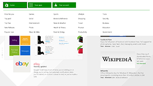 [Click on image for larger view.] Figure 4. The new Windows Store interface vastly improves navigation and discovery of apps.
Modern-UI-ized Management
Major props to Microsoft for the entirely useful PC Settings facility in Windows 8.1, which puts a host of system-level controls under a unified, Modern-style interface. Swipe in from the right, touch Settings and then touch the Change PC Settings link. Now you can do things like manage displays, accounts, power settings, network configuration, Windows Updates and many other system activities without getting dumped into the legacy Control Panel interface. And a quick note about the new -- and much improved -- Task Manager applet in Windows 8.1: It may be a desktop-style app, but the sleek design is enough to prevent me from loading the outstanding Sysinternals Process Explorer utility on my Dell XPS 12 convertible laptop.
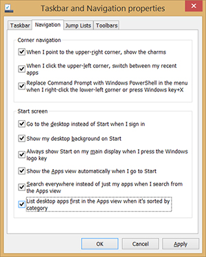 [Click on image for larger view.] Figure 5. Users can dial in a more Windows 7-like experience from the Taskbar and Navigation Properties dialog box.
It Goes to 11
Add Internet Explorer 11 to the list of things that have significantly improved under Windows 8.1 My experience with Internet Explorer 10 in Windows 8 was not good -- the browser hung, crashed and generally misbehaved. Within half an hour of installing the Windows 8.1 update on my Dell XPS 12 convertible, it was clear that Internet Explorer 11 is a better, faster and more stable browser than the one that preceded it.
Microsoft has made Internet Explorer more useful as well, bolstering support for Favorites with an updated app bar UI that includes folders for organizing pages, and enabling syncing of Favorites and other browser settings via your Windows account to other Windows 8.1 systems. Internet Explorer 11 also eliminates the 10-tab limit on open pages and supports side-by-side viewing of pages. Just long-press a Web link and touch Open in new window to have the linked page appear onscreen next to the current Web page. While you can swipe forward and backward through browser pages, there's no tab cycle gesture -- you have to swipe up and then press the desired tabbed page at the bottom of the screen.
About the Author
Michael Desmond is an editor and writer for 1105 Media's Enterprise Computing Group.