Practical App
How-To: Delivering Intelligence with SharePoint Dashboards
Integrate data from disparate sources into scorecards with rich data visualization for interactivity and workflow automation.
We live in the era of data-driven decision making. Robust data infrastructures help organizations collect unlimited volumes of data from myriad sources. They can then integrate and analyze that data, driving intelligent business decisions based on concrete information.
A powerful data back-end like Microsoft SQL Server is essential, but so, too, is a rich presentation layer -- one that harnesses information and helps drive the decision-making process. You want to present this Business Intelligence (BI) in the most effective way possible. You want to give your users control over their experience, and leverage the existing presentation and collaboration resources in your IT infrastructure.
SharePoint 2010 can help you deliver rich BI solutions directly to the information workers in your organization. By leveraging easy-to-use tools and a familiar environment, SharePoint 2010 helps you provide self-service BI functionality, empowering users and reducing costs for your IT department.
As part of that BI infrastructure, SharePoint 2010 dashboards and PerformancePoint Services are powerful decision-making tools. SharePoint dashboards integrate data from disparate sources into scorecards, enhance scorecards with rich data visualizations, and enable deep interactivity and workflow automation.
Information vs. Intelligence
The first step in empowering users to make data-driven decisions is not a technical feat. Instead, you must carefully consider the most important kinds of information to present to your business decision makers.
What components of your amalgamated business data actually count as intelligence? What information can users actually act upon when making decisions? It may be sales data, job performance, customer satisfaction, logistics or supply chain information. It may also cut across numerous variables, such as sales data by region, inventory by supplier and so on.
These critical measures are called Key Performance Indicators (KPIs). They represent the metrics you set to define success. It's crucial that you and your IT staff and the business decision makers work together in establishing the appropriate KPIs. You want your information workers have the best intelligence upon which to act when making those decisions.
Build Your First Dashboard
The first step in building a SharePoint dashboard is installing PerformancePoint Dashboard Designer. The Dashboard Designer is a rich client application that lets you create data sources, dashboards, scorecards, KPIs, custom indicators, filters and reports -- all of which you can publish directly to SharePoint Web sites.
Once you've configured PerformancePoint Services for your organization, you can install Dashboard Designer by visiting the Business Intelligence Center site within your SharePoint infrastructure. After completing the initial installation, you can access the Dashboard Designer directly from your Start menu.
Your next step is to select the data sources you need to contribute to your dashboard. Those data sources can include SharePoint lists, instances of SQL Server, SQL Server Analysis Services, Excel Services or even Excel workbooks.
Once the data source connections are active, you can begin to build KPIs. When creating KPIs, select the data points you want to measure -- for example, sales data from SQL Server Analysis Services. You also need to choose targets against which you want to measure that data, which might be sales quotas as defined in a SharePoint list of your sales associates.
Once the KPIs are accepting data from multiple data sources, PerformancePoint Services helps connect critical business data and portray it in a meaningful way to business decision makers. You can also base SharePoint 2010 KPIs on calculated values, like the sum of several sales figures representing revenue for a defined sales territory. When defining KPIs, you can also select appropriate visual indicators. This is often something like red/yellow/green stoplights that indicate when the values meet, exceed or drop below certain targets.
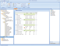
After defining your KPIs, you can build scorecards for your dashboard. Scorecards display a collection of KPIs to give you a high-level overview of organizational performance. For example, you can build a scorecard that shows sales performance against quotas across every sales territory or different product lines. Once you've added the appropriate KPIs to your scorecard in Dashboard Designer (see Figure 1), you can publish your scorecard to a SharePoint dashboard.

[Click on image for larger view.] |
| Figure 1. An assembled scorecard in PerformancePoint Dashboard Designer. |
Data Visualizations
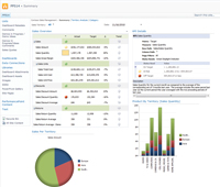
They say a picture is worth a thousand words, and with good reason. Visual images display a rich depth of information at a glance. With PerformancePoint Dashboard Designer, you can create and publish data visualizations that help you to present critical business data in a visually compelling way (see Figure 2).

[Click on image for larger view.] |
| Figure 2. An assembled SharePoint dashboard including visualizations. |
Dashboard Designer lets you create reports that leverage familiar analytic chart and graph controls, but also provide a high degree of depth and interactivity. For example, you can create a report with a pie chart of sales revenue broken down by sales representative. You can also let your business users redisplay the report as a bar chart or line graph, re-sort the data, apply value filters, show or hide particular information and more.
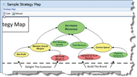
Besides using traditional visualization forms like charts and graphs, PerformancePoint gives you some innovative new approaches to data visualization. Strategy Maps, for example, let you connect business data to Visio diagram shapes, such geographic maps or process diagrams, as shown in Figure 3. Strategy maps help connect business data to visual representations of real business processes. With strategy maps, you can get a quick glance of sales performance by region, progress against your strategic plan, or supply chain performance.

[Click on image for larger view.] |
| Figure 3. A strategy map connects business data to visual representations. |
Interactive Intelligence
By delivering business data dashboards with SharePoint 2010, you can give your business users a level of interactivity they won't find in other BI solutions. In SharePoint dashboards, users can dig deeper into the data, drilling into the KPIs to develop a better understanding of the information that lies within and how it impacts organizational performance.
In a KPI that displays sales revenue by region, for example, a user may wish to drill down further to see what product lines are performing best, and where underperformance needs to be addressed. They can also pivot on data within those KPIs, applying filters and combining additional data sources to understand the root causes of the data results.
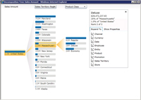
To that end, one of the most helpful analytical features of the PerformancePoint dashboards is the Decomposition Tree. The Decomposition Tree (see Figure 4) is an analytics tool that helps users perform root-cause analyses. Using an interactive, Silverlight-based control, they can deconstruct report elements to see the individual components of a composite figure. This helps them understand how various contributors impact the final number.

[Click on image for larger view.] |
| Figure 4. A decomposition tree shows contributing factors to a KPI. |
When you connect dashboard elements, you get an additional level of interactivity. For example, you can configure a dashboard so that when a user selects a region on a scorecard of regional sales data, another Web part on the page -- a KPI Details report -- refreshes to show additional information. This could be data about the salesperson responsible for that region, their quota, contact information and so on. You can retrieve this data from completely disparate data sources, but continue to connect it by common attributes (like sales territory) by way of the dashboard.
Working with Workflow
The SharePoint dashboards also use the powerful workflow functionality already built into SharePoint. From within a SharePoint dashboard, users can perform business tasks, which are then executed by the SharePoint workflow engine. For example, if a salesperson reviews his dashboard and finds he's is likely to miss his quota, he can submit a request to his manager for an adjustment. Then his manager can approve or reject the request before any change is reflected in the dashboard.
SharePoint dashboards provide integrated, tailored BI. They empower information workers to make data-driven decisions. With rich, visual, interactive intelligence, the decision makers in your organization have access to the information they need quickly and easily, in useful and familiar formats. With its self-service-oriented approach, the burden on you and your IT staff is greatly reduced, helping to save both time and money.
Thanks to Leif Brenne and Craig Boobar for their assistance in the development of this article.
About the Author
Joshua Hoffman is the former editor in chief of TechNet Magazine. He's now an independent author and consultant, advising clients on technology and audience-oriented marketing. Hoffman also serves as editor in chief of ResearchAccess.com, a site devoted to growing and enriching the market research community. He lives in New York City.