In-Depth
First Look: Microsoft Power BI
Microsoft forges design, analysis and presentation into a simple, cohesive strategy with this important new tool.
- By Pat Esposito
- 05/29/2014
Microsoft's business intelligence (BI) strategy for years has been all over the place. No one can argue the sheer number of BI tools Microsoft offers -- from SQL Server and SharePoint on the back-end, to everything from Access and Performance Point Dashboard Designer in between and on the client side. The last time I counted there were 26 tools spread over a dozen products, each unique in its own way.
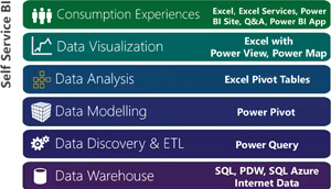
While Microsoft continues to enhance its portfolio of BI tools, the recently released Power BI introduces new capabilities integrated into familiar platforms, namely Excel 2013, Office 365 and SharePoint 2013. Looking past the technology and features, Power BI establishes the roadmap for creating extremely powerful, interactive self-service BI solutions (see Figure 1). With Power BI, Microsoft has committed to focusing on Excel as a BI design and analysis tool, while using SharePoint to manage and present the resulting reports and dashboards.
 [Click on image for larger view.]
Figure 1. The Microsoft self-service business intelligence stack.
[Click on image for larger view.]
Figure 1. The Microsoft self-service business intelligence stack.
For a moment, forget everything else you know about the myriad of BI tools you may already be using. The new Microsoft Power BI makes Excel the front-end design and analytics tool using SharePoint as the conduit to other data sources. Power BI brings to life the notion of "design and surface analytics... using Excel and SharePoint." Don't worry, I'll address the white elephant in the room (Office 365), too.
Excel 2013: Design and Analysis Tool
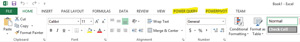
For years we've been able to analyze and chart data using Excel. It's arguably the most popular BI tool on the planet. Power BI takes us leagues further by leveraging new Excel 2013 built-in features and free add-ins, which include Power Pivot, Power View, Power Query and Power Map (see Figure 2 and Figure 3).
 [Click on image for larger view.]
Figure 2. Power Query and Power Pivot appear as new tabs in the Excel Ribbon.
[Click on image for larger view.]
Figure 2. Power Query and Power Pivot appear as new tabs in the Excel Ribbon.
 [Click on image for larger view.]
Figure 3. Power View and Power Map appear as groups in the Insert tab of the Ribbon.
[Click on image for larger view.]
Figure 3. Power View and Power Map appear as groups in the Insert tab of the Ribbon.
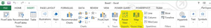
Power Pivot (see Figure 4) is a data-modeling tool, used to create data relationships, calculated fields and key performance indicators (KPIs). It's the very core of any BI solution.
 [Click on image for larger view.]
Figure 4. The Power Pivot tab on the Ribbon lets you create and manage your data models.
[Click on image for larger view.]
Figure 4. The Power Pivot tab on the Ribbon lets you create and manage your data models.
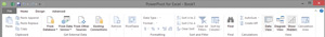
Once you launch Power Pivot using the Manage button, you'll get a new window with a dedicated Ribbon containing Home (Figure 5), Design (Figure 6) and Advanced tabs (Figure 7).
 [Click on image for larger view.]
Figure 5. Power Pivot Ribbon showing actions on the Home tab.
[Click on image for larger view.]
Figure 5. Power Pivot Ribbon showing actions on the Home tab.
 [Click on image for larger view.]
Figure 6. Power Pivot Ribbon showing actions on the Design tab.
[Click on image for larger view.]
Figure 6. Power Pivot Ribbon showing actions on the Design tab.
 [Click on image for larger view.]
Figure 7. Power Pivot Ribbon showing actions on the Advanced tab.
[Click on image for larger view.]
Figure 7. Power Pivot Ribbon showing actions on the Advanced tab.
Power Pivot isn't new -- it was initially released in Excel 2010 as a downloadable add-in, but now it's included in Excel 2013.
One particularly nice feature of Power Pivot is it opens in a separate window. As a BI designer, you'll appreciate the convenience of switching windows to correct your model as you design your analytics.
Under Get External Data Group, on the Home tab of the Power Pivot Ribbon, you'll notice quite a number of pre-built data connections and you can also create your own. Some of the more interesting connections include: SQL Azure, IBM DB2, Microsoft Analysis Services, Power Pivot, Oracle, Teradata, Sybase, OData, Excel and text files.
The most important thing to know is using these connections will only bring the data into memory. It doesn't actually import data as rows of a spreadsheet. This means analysis relying on Power Pivot data sources and models will run fast and smash through the 1,048,000 maximum rows of a spreadsheet. More data and more power equals better analysis leading to better business decisions.
Keeping data in memory and using a refreshable connector means you're working with data in real time, and increases the odds of having updated and accurate data, assuming your data stewards are on the ball.
Power Query (see Figure 8) is basically a connection manager and query tool on steroids, allowing Excel to connect to a wide variety of data sources, both internal and external to the organization. Microsoft says this Excel add-on (downloadable here) enhances BI by simplifying discovery and access. It includes a public search feature, only intended for use in the United States.
 [Click on image for larger view.]
Figure 8. Power Query tab on the Excel Ribbon.
[Click on image for larger view.]
Figure 8. Power Query tab on the Excel Ribbon.
Unlike Power Pivot, Power Query will import the resulting data as rows into an XLS file. This is particularly useful when data needs additional transformation, or when the source is changing, such as querying data from a weather Web site.
Even though Excel has had data connections for many years and still does, Power Query provides more granular control over those data sources.
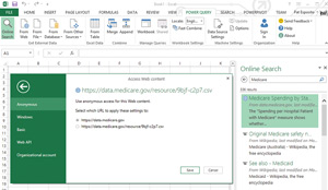
An important feature of Power Query is the ability to query online search. Using freely available, online data sources allows you to compare your internal data to your peers or industry norms.
One example of how this might be useful is a health-care provider, which might look at its Medicare receipts compared to others in the same or different states (see Figure 9).
 [Click on image for larger view.]
Figure 9. A health-care provider can query resources from the government's Medicare site.
[Click on image for larger view.]
Figure 9. A health-care provider can query resources from the government's Medicare site.
Of course, the data returned by Power Query can also be added to the models in Power Pivot, allowing you to create even more insight.
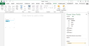
Power View is the Report writer/dashboard is easy to use and makes everything else forgettable. Once you insert a Power View report from the Insert tab of the Excel Ribbon, a new Power View sheet is inserted as a tab right next to your workbook tabs (see Figure 10).
 [Click on image for larger view.]
Figure 10. Power View sheets inserted as tabs in the Excel Ribbon.
[Click on image for larger view.]
Figure 10. Power View sheets inserted as tabs in the Excel Ribbon.
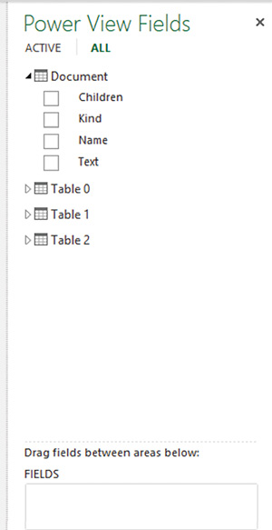
Power View will automatically display the tables and columns you manage through Power Pivot or return using Power Query in a familiar pane on the right side of the Excel window (see Figure 11).
 [Click on image for larger view.]
Figure 11. Power View Field Pane allows you to easily select tables and columns.
[Click on image for larger view.]
Figure 11. Power View Field Pane allows you to easily select tables and columns.
Once you select fields or drag tables into the Power View Report, the Design tab will present additional options for creating your analytics (see Figure 12). The Table action in the Switch Virtualization group allows you to change the presentation of your table data to various formats such as tabular, matrix, charts or maps. Anyone who regularly creates charts in Excel will appreciate the improvements.
 [Click on image for larger view.]
Figure 12. Power View sheet with the Design tab selected.
[Click on image for larger view.]
Figure 12. Power View sheet with the Design tab selected.
The familiar Slicer is also available. If you aren't familiar with the Slicer in Excel, it's effectively a filter, but a filter that can control the presentation of any or all tables, charts and maps on the screen. Drill into your slicer and the entire presentation changes.
Power Map is for geo-spatial reporting and analysis. It's an add-in for Excel and can be downloaded here.
When you first click on Power Map from the Inset tab on the Excel Ribbon, a new Power Map Window will display.
Using Power Map requires your data has some geo-locator information from which to plot -- country, state, even ZIP code work, but precision work is best with geo-locator (lat/lon).
The output of a Power Map analysis is viewed in neither Excel nor SharePoint. It's simply a movie to watch. Using Power Map you can see how data changes over time. It's a serious eye-opener and impactful tool. For more on Power Map, Microsoft has created demos worth exploring, which you can check out here.
SharePoint Surfacing Analytics
Leveraging SharePoint, reports created using Excel can be presented on Web pages. Microsoft utilizes Excel Services and Power Pivot Services for SharePoint to make this happen. Both are available in SharePoint on-premises and Power BI for Office 365 sites.
This is where the story can take different twists and turns. The Microsoft "Cloud First" model has introduced a few features in Power BI for Office 365 simply not currently available in SharePoint on-premises.
Exclusive to Power BI for Office 365 is the Power BI Site. The Power BI Site can surface both Power View and traditional Excel Services dashboards created in Excel. It introduces new ways of managing featured and favorite reports, it schedules report updates and, overall, provides a more pleasing UX.
Another exclusive feature to Power BI on Office 365 is Q&A. Microsoft calls it a "natural language-based experience for interacting with data." It uses "natural language to find, understand and report over your data."
By entering natural language into a search query, Q&A finds the best case report, applies filters and presents the results to the user.
In case anyone gets really blown away by Q&A, just remember Q&A doesn't "auto-magically" create an analytic on the fly. It relies on the reports and analysis you created and stored in your Power BI libraries. It helps to easily locate, filter and present the most relevant report. Your life as a report designer doesn't go away. In fact, you'll want to exact some care so your reports appear in the correct context when searched.
Watching demonstrations of Q&A stimulates you to think about some really futuristic applications. How cool would it be for the new CFO, on day one, to simply enter queries and get reports with no human interaction, or tickets to the help desk? Another possibility: I could speak my query and get the resulting analytic to display on my navigation system, while driving to visit a customer.
Connecting the Dots
One important technology that falls into neither Excel nor SharePoint (on-premises or Office 365) is the Data Management Gateway. When the situation arises that a Power BI solution running in the cloud needs to reach back behind your corporate firewall to pull in data securely, Microsoft has an app for that, the Data Management Gateway. The Data Management Gateway is a client agent that runs as a Windows Service. Setup is straight forward, but should be left to IT professionals.
Power BI is setting the direction for the future. It doesn't eliminate traditional Microsoft tools used to create enterprise BI solutions, but it forges a new direction for self-service BI, driving more capabilities into the hands of report designers and power users.
Anyone interested in learning more about Power BI should install the add-ins for Excel 2013 and start creating new queries, models and reports. Once you've gotten comfortable with designing new reports and analysis, then it's time to decide how you want to make your report easy to find, use and share.
Determining whether to use Excel's Power BI features in conjunction with Office 365, SharePoint on-premises or a hybrid solution is a sizable discussion and decision. For now, let's just agree that all three SharePoint scenarios are possible and the decision probably rests with your current investments, existing capabilities and how far into the cloud you've already risen.
For most organizations, Power BI will be used by technical support folks to build more valuable analysis easier and faster than ever before. As a set of capabilities built on top of already familiar tools, the learning curve should be minimal and the output can be more intuitive, useful and inviting.
With Power BI, Microsoft has brought together an integrated suite of tools to build greater insight, empowering users at organizations of any size, regardless of technical skills or past reporting experience.