Product Reviews
Office 2010: Is It Worth an Upgrade?
Microsoft will release the next version of its stalwart Office suite next year. Will it bring enough to the table to warrant upgrading?
It was clear that, with the release of Office 2007, Microsoft focused on collaboration with Microsoft Office SharePoint Server. The Office 2010 Suite follows that same path, boasting improvements in integration with SharePoint Services and Windows Live. There's also the promise of Office Web Apps (not including Access), an online version of the suite that could potentially give Google Apps a bit of healthy competition. Users will now be able to access their files anywhere there's an Internet connection, save files directly to SharePoint and collaborate and edit documents simultaneously with other users. Microsoft also promises compatibility with a variety of browsers, including Firefox and Safari.
But will Office 2010, which is due in the first half of next year, provide enough of a change from Office 2007 to make existing 2007 users' mouths water? Or will it just be a better landing point for those who never made the move to 2007 and will be upgrading from Office 2003?
Universal Improvements
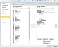
The most notable changes in Office 2010, compared to its predecessor, are the across-the-board modifications in navigating the applications. The highly criticized ribbon interface from Office 2007 is back and now graces all the Office applications, even Publisher and OneNote. As a compromise to the ribbon's many critics, users are now able to customize the ribbon without having to delve into XML to add their own tabs and commands. Just as with the Quick Access Toolbar, users can scroll through a list of commands and simply click Add, which will add them to the tab or group of their choice or create a new tab for their own commonly used commands (see Figure 1).

[Click on image for larger view.] |
| Figure 1. Customizing the ribbon. |
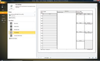
Another change to the ribbon is the absence of the orb-like Office button. A new tab called Backstage View features a beautiful, full-screen menu containing all the actions that pertain to a file as a whole such as save, open, share, print and, of course, the file's properties. The most useful aspect of this view is the improved print view, which combines all the previously buried printing and layout options and places them next to a sleek print preview of your file (see Figure 2).
Microsoft has also beefed up its image and illustration tools. Most applications within the Office Suite now have the ability to insert a screenshot or screen clipping from within the application. PowerPoint, Word and Excel all have new and improved image-editing capabilities where users can apply a variety of artistic effects. Back in 2007, SmartArt replaced the diagrams gallery. In 2010, users can see some additional layouts to choose from, as well as more options for editing SmartArt, including the ability to convert SmartArt to simple shapes. But best of all, creating and controlling gradient stops when formatting the color within shapes is a lot easier to do than it was in previous versions. Rather than a drop-box controlling the color and position of a stop, users see a more intuitive sliding bar, which gives them a live preview of their gradient as they make changes.

[Click on image for larger view.] |
| Figure 2. The Print options from Backstage View. |
One final universal addition to the suite is the Paste Preview feature, which allows users to see a live preview of what they're pasting before they actually paste it. We'd stick this in the list of improvements we didn't know we wanted but think are kind of cool to have.
As for the individual applications, new features and enhancements vary widely depending on the application, as does our take on each.
| REDMOND RATING |
|
Installation 20% |
10.0 |
|
Features 20% |
8.0 |
|
Ease of use 20% |
8.0 |
|
Administration 20% |
8.0 |
|
Documentation 20% |
8.0 |
|
Overall Rating: |
8.4 |
Key: 1: Virtually inoperable or nonexistent 5: Average, performs adequately 10: Exceptional | | |
Access 2010
In line with Microsoft's push for Web compatibility and sharing, users can now publish Access databases to the Web -- with some limitations, of course. But don't worry; the Access team has included a compatibility checker to identify items and settings that aren't supported on the Web. And continuing with the Web 2.0 theme, browser controls, buttons, tabs and other improved design elements make it a little bit easier for users to create Web-style database navigation.
Another big change to Access is a complete overhaul to the Macro Designer. IF statements are much easier and more intuitive to create. Designed to be more "logical" in appearance, Macro Designer looks like a programmer's version of Mad Libs: pick an action and then fill in the blanks. This will take some getting used to for longtime users of Access and may even be very difficult for newbies to grasp. Also new in the Macros functions is the ability to create Data Macros and Table Events, which centralize logic on the table rather than on the form.
One of the most welcome improvements to Access is the addition of IntelliSense to the expression builder, featuring AutoComplete, a dropdown list of suggested words, be it objects or functions; Quick Info, which displays the complete declaration for a function; and QuickTip, providing additional information about a UI component. IntelliSense makes expressions much easier to create and functions easier to locate -- writing expressions in Access 2010 is almost as easy as writing expressions in Excel.
Other additions include Application Parts, which allow users to reuse database parts built by others; a Navigation Form that allows users to drag and drop fields onto a form; and support for conditional formatting and data bars in reports. Plus, although this runs contrary to conventional wisdom about database design, users can now create calculated fields from inside a table.
Excel 2010
We're disappointed by the lack of visible new features in Excel 2010. With all the wonderful improvements and additions to the 2007 version, the 2010 release feels like igniting a roman candle after watching a glorious grand finale at a firework show. In fact, there are really only three additions worth mentioning here. The first are Sparklines, which are small column charts designed to fit snugly into a single cell to graphically and quickly display trends in adjacent data. The second are Slicers, which provide yet another, but slightly more visual, way of filtering PivotTables -- this expands the business intelligence client role of Excel. The third is Excel Web App, with which multiple users can edit a spreadsheet simultaneously.
However, under the hood, Excel has some improvements that are worth mentioning. Microsoft is releasing a 64-bit version of Excel, which will allow the spreadsheet app to address its current memory limitation of no more than 2GB. Without a doubt, this will speed up and improve performance. There are advancements to the calculation engine that will improve the speed and accuracy of math, as well as of financial and statistical functions. There's also a new version of Solver on the way.
Word 2010
Much like Excel, Word also lacks new visual features. The word processor offers the same text effects as Word 2007 and some new OpenType typography. There's also the same additional SmartArt Graphics, picture-editing tools and collaboration features that are available in the rest of the Office 2010 suite. On the plus side, Microsoft has done away with the Document Map and replaced it with a Navigation Pane. It's a bit more intuitive to use, thus making it much easier to drag and drop, or otherwise rearrange, sections of a long document. Microsoft is really touting Word's collaboration features; automatic offline editing and syncing of shared documents; and the Word Web App capabilities. These are all certainly steps in the right direction.
Outlook 2010
The new additions to Outlook are few, but Microsoft has made some significant improvements.
The best addition is the new Conversation View, which groups related messages and replies together and helps to keep inboxes clean. However, the icon representing the multiple threads isn't easy to spot. Currently, it's the standard open-envelope icon -- only there are two of them together. This function might work better visually if Outlook used a different icon or, at least, made the Conversation View icon a different color.
Another addition we're thrilled to see is Quick Steps, a feature that combines multiple steps into one single click. Think of them as macros in training wheels. By default, Outlook gives users nine basic quick steps. However, users can create their own custom quick steps. Among the most notable are Saved, which moves a message to a user's saved-messages folder; Meeting Reply, which automatically creates a meeting request to be sent to the recipients of an e-mail the user has selected; and Team E-Mail, which automatically creates a new e-mail to a specific group of recipients. But those are just a few examples of the improvements in Outlook 2010.
Other new additions include MailTips, a warning to new users before they commit an e-mail faux pas, such as accidentally clicking Reply All instead of simply Reply; a new Clean Up feature to combine related messages; a new Ignore feature that allows users to ignore and automatically delete threads that aren't that important; and, of course, new and improved experiences with Web and mobile devices.
Keep in mind that some of the features in Outlook 2010 will only be available with the use of Exchange 2010. For example, there's a new Archive Mailbox feature in Exchange 2010 that's only available in Outlook 2010 or Outlook Web Access 2010.
PowerPoint 2010
PowerPoint is the program that impressed us the most visually, because Microsoft improved every area we were hoping would see improvement. In addition to offering the same new features that appear across the other Office apps, PowerPoint now sports new and improved slide transitions, which look much smoother and are stylistically updated. Transitions and Animations are now separated on their own respective tabs, a change most welcome considering how frequently new users would confuse animations with transitions. Microsoft has also made creating and editing animations within the ribbon more intuitive. Settings such as duration, delay and triggers are a lot easier to find and manage. Plus, moving these options to the ribbon leaves more space in the Animation Pane to view the timeline. And for users who are fans of the Format Painter, there's now an Animation Painter that lets users easily copy transitions from one object to another.
An excellent addition for those of us who can't keep our presentation short and concise is the ability to create sections in the presentation. This lets users easily organize and navigate slides, dividing the presentation into more manageable sections.
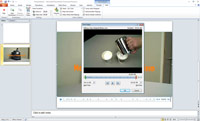
Also revamped for the 2010 release is the eagerly awaited Create a Video option, with which users can convert their presentation to the .WMV movie file format. Along those same lines, PowerPoint users also have a variety of new media options for use in their presentations. Users can edit or trim videos from within PowerPoint (shown in Figure 3), and during a slideshow users can pause, fast-forward, rewind or jump to a particular section of the video by using bookmarks.

[Click on image for larger view.] |
| Figure 3. Trimming a video in PowerPoint 2010. |
PowerPoint 2010 includes another eagerly awaited media option: the ability to view videos from online video sites like YouTube or Vimeo. All users need in order to show videos during presentations is a working Internet connection and the embedded code from the video-sharing site. For audience members who can't attend a presentation, PowerPoint presenters can broadcast their shows via SharePoint to someone's browser, even if that person doesn't have PowerPoint.
OneNote 2010
If the rumors are true, Microsoft is going to include OneNote in all editions of Office 2010. Like its big brothers and sisters, OneNote sports a number of multiple-user editing and sharing options, not to mention the ability to link notes to other files, whether it be a Web page, a PowerPoint slide or an Outlook Team Meeting.
Linking is a cool little feature. With it, users can take notes in OneNote while working in another application like Excel. From its notebook, OneNote will keep track of the working location in Excel of when the user took the note. The only criticism here is that the split screen and docked OneNote book is a bit cumbersome and takes some getting used to.
Other new additions to the program include Quick Filing. This lets users pick a notebook to send notes to as users insert them. OneNote 2010 also offers improved search navigation; co-authoring and simultaneous sharing; and versioning, which provides tracked changes and makes it possible to both undo changes other users make or sync changes with other users.
Publisher 2010
Publisher is a disappointment only because it lags behind the other Office applications. Publisher is now caught up with the 2007 version but lacks most of the cool new features that Word, Excel and PowerPoint have in Office 2010. Remember the awesome background-removal tool? Yeah, it's missing from Publisher, which is the one program that should have it. Publisher does, however, contain the basic new features of the suite, such as Paste Preview, OpenType Typography, some of the picture-editing tools and Backstage View.
On the plus side, there's a new Save for a Commercial Printer option. This lets users save documents for "high quality printing," "commercial press," "minimum size" or "standard" -- or create their own custom publishing options. It'll be interesting to note what professional printers have to say about this. They've generally shunned Publisher, and we're curious if this new option will change Publisher's reputation.
The Final Verdict
It's easy to see that Office 2010 has two important directions to pursue: collaboration and Web-based functionality. Microsoft is certainly focusing on those goals. However, the majority of users today may not need the collaboration aspects of Office 2010. For Office 2007 users, the lack of significant visual or functional improvements in some of the major applications -- such as Word, Excel and Outlook -- means that, overall, Office 2010 likely won't provide the same excitement that the enhancements in Access and PowerPoint might generate.
Office 2007 users may be better off staying with 2007, except in companies that bring the underlying infrastructure of SharePoint and Exchange to the 2010 platforms, in which case Office should match the servers. However, users still stuck on Office 2003 should upgrade. The combination of improvements from 2007 and 2010 are well worth the price.